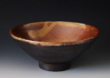
Remember that architectural assignment I did waaaaay back in February? (click here.)Finally~ the long awaited results!
I have mixed feelings about it. It was a success in that it didn't blow up in the kiln, and I do like the concept behind it, and quite enjoy the shape of the forms. But, we are doing low fire for this class, and the low fire glazes that are available to us I am not super-duper crazy about. I do think the bright colors make it appear a bit more whimsical, but I also feel it gives it an adolescent feel.(Whereas some of my pieces I adore, & have about the house, this seems more appropriate for a children's room.) I tend to prefer a bit more natural color, and it makes me wonder how I'll go about glazing my next project. I guess in part, that's why we take classes, to find out what works & what doesn't... what we like & what we don't. I may however, revisit the concept again at a later date.
:)


12 comments:
Hi Becky, The contrast between the polar scene and the urban scene is even greater because of the vivid glaze which I think goes well with the curvy buildings. It's exciting to see these pieces after firing! So snowy here in the mts, Becky - I have my grandchildren over spring break, but Jack is sick so he and I have to play inside while the older 2 go skiing.
I like this piece very much, but I understand what you mean about the colors. Would you be happier with muted earth tones? Where did you get the idea for the buildings? I just love they way they rock and roll.
I struggle with thinking everything has to be prize worthy. Thanks for the reminder to try new things.
Kim,
there is a saying out there "in order to be a great artist, you must be willing to make bad art." (Not that any art is bad per say, but perhaps a starting point, or jumping off point, or like you say, the willingness to try something new.) Wouldn't it be great, though, if they were all masterpieces!
:) signed,
the perpetual student.
Love the unique buildings, Becky. The bright colors make me think...New Mexico meets Alaska!
Becky, the bright colors are actually my favorite part of the piece. I also like how the buildings move through space.
You are right about classes and also just doing, this is how we learn and we are not going to like everything we do. xoxo
I like it. It is an interesting concept. Maybe it will be a reoccuring theme along with the bears
Dad
I agree with you, class is a great place to explore and learn what we like or do not, what works and does not. Color for an artist is huge! Wishing you ah ha's to your next color project!
I find the bright colors appealing and yes would catch a childs eyes as well as others, I have seen so many of your pieces and love so many Becky.
I really like this piece Becky. To me it's like a reverse of Global Warming. The power of the bears animal spirit is melting the urban scene.
First off, I just love the concept. Secondly, I love the curvy buildings. I like the idea of the bright colors symbolizing New Mexico, but I can understand you wanting to use more muted earth tone colors.
Wow - looks like a Salvadore Dali !
And the colours make the buildings stand out !
Great work, Becky !
Post a Comment